A professional business website: the anatomy of a useful service page

In this article
Imagine a customer comparing three businesses during a lunch break. One page says “quality service”. Another has an impressive animation. The third explains the service, shows relevant work and says what happens after an enquiry. The third has made the decision easier—even before anyone speaks.
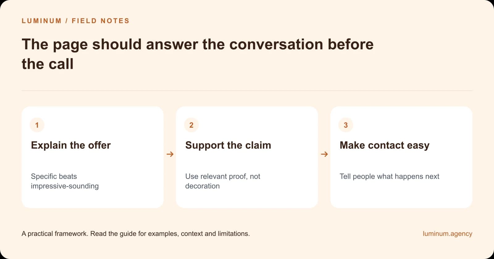
Begin with a specific promise you can support
Name the service and the customer it helps. Explain the practical outcome without promising a result outside your control. If availability, coverage or eligibility matters, make it visible early.
Avoid claims such as “guaranteed leads” unless there is a precise, supportable contractual meaning. A website can improve the buying experience; demand, pricing, competition and follow-up still affect commercial outcomes.
Explain the scope before the sales pitch
Describe what is included, what is not and what information is needed for a quote. A customer should not have to submit a form to discover a fundamental limitation. Where a fixed price is not possible, explain the factors that change the cost.
Use plain language. If the service involves a technical term, explain it when it first appears. Your customer should not need to learn your industry's internal vocabulary to decide whether you can help.
Put proof beside the claim it supports
A project image can show workmanship. A permitted testimonial can describe an experience. A qualification can establish relevant credentials. Explain what each item demonstrates instead of assembling an unexplained wall of logos.
Do not use stock photography as evidence of your team or completed projects. Do not invent results to fill a case-study template. An honest example with limited scope is more useful than a dramatic unsupported percentage.
| Compare | Reader question | Useful evidence |
|---|---|---|
| Opening | Is this the service I need? | Specific offer and coverage |
| Scope | What do I get? | Inclusions, exclusions and cost drivers |
| Proof | Why should I trust this? | Relevant, permissioned examples |
| Enquiry | What happens if I contact you? | Clear action and honest response expectations |
Make the next step predictable
Use a clear action such as requesting a quote or booking an assessment. Explain what happens next and the response window your team can actually meet. Offer an alternative contact route when it is practical and maintained.
Keep forms proportionate. The first enquiry can gather enough to route the request; detailed qualification can follow when appropriate. Include meaningful labels, helpful error messages and a confirmation that does not disappear before the customer can read it.
Design for reading, not just a screenshot
Use descriptive headings, readable line lengths and comparison components where the choice is genuinely complex. Keep important information in text and make visuals explain relationships. A page can be visually rich without surrounding every sentence with a separate card.
Test on a narrow screen and with a keyboard. Check that menus, sticky elements and contact tools do not obstruct the page. Accessibility is part of professional delivery, not an optional decorative layer.

Measure the whole journey
Record useful enquiries and their outcomes, not only button clicks. If customers repeatedly ask a question the page should answer, improve that section. If the enquiries are relevant but staff cannot fulfil them, adjust availability or the promise.
A professional website is not finished when the design is approved. It becomes more useful as the business learns what customers need to know.
Related reading
- Your website gets no customers? Diagnose the missing step
- 10 website design tips you can test on your own site
Sources and further guidance
Substantively updated in October 2026. Examples identified as illustrative are not client results.

